DB Streckenagent
Compare mobility options at your location
Product
Mobile App
My Role
UX/UI Design
Date
2023 - ongoing
Project of
Mobimeo
Client
Deutsche Bahn
About the Project
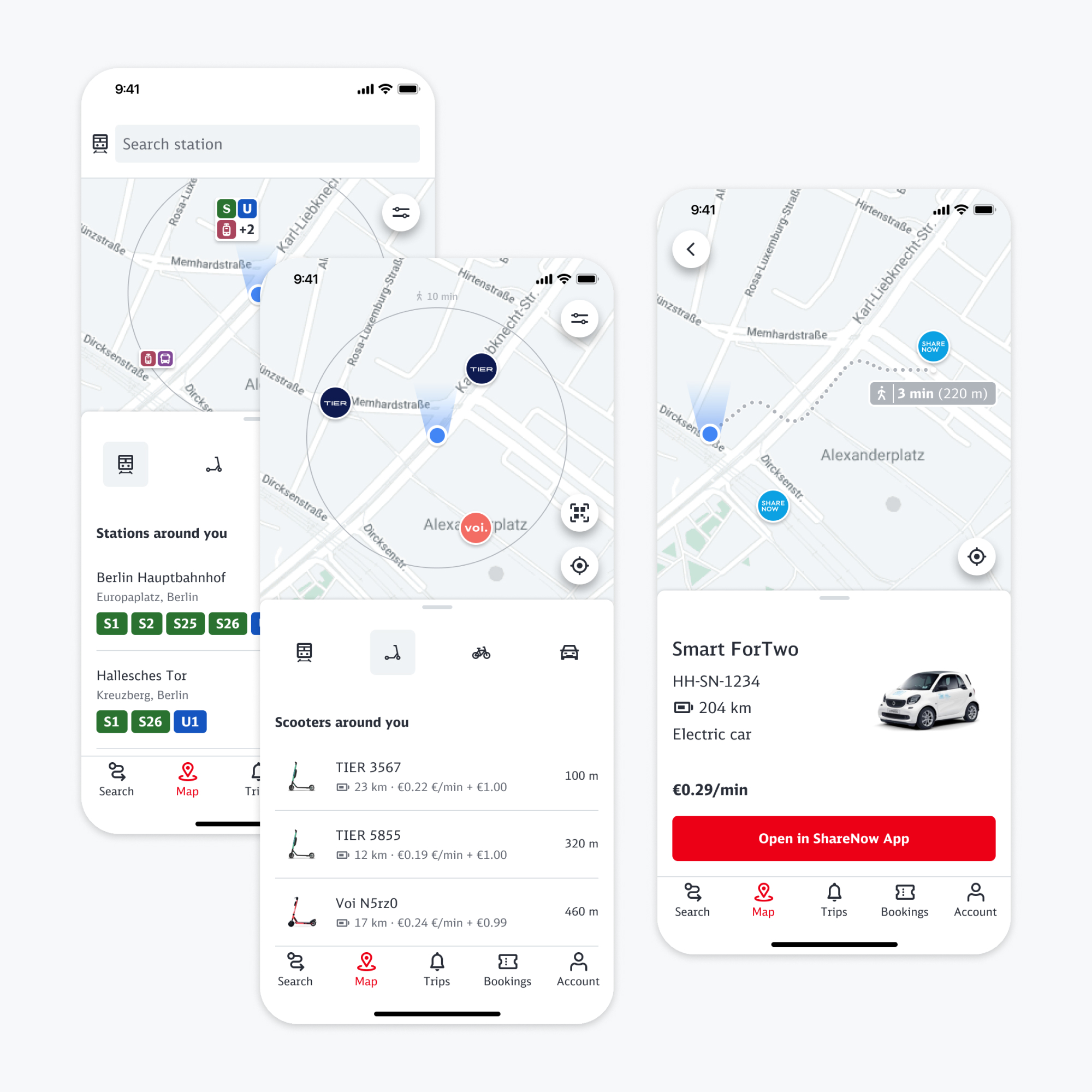
DB Streckenagent combines public transport and sharing providers to allow seamless transport in all regions of Germany. As a UX/UI Designer at Mobimeo one of my main areas of expertise was the flow for discovering different transport options on the map.
The Situation
We were facing the problem that our users needed to subsequently select vehicles from the map to compare them. This pattern would sometimes make the search for a specific type of vehicle a lengthy and frustrating task. To speed up this process and enable users to quickly find a satisfying transport option we developed a list view showing vehicles and stations around the user's location.
Problem
As a user I have no detailed overview of mobility options at my location so I need to subsequently select vehicles to compare them
How might we
Create a user friendly overview of available mobility options
To
Support users to efficiently select a mobility option they are happy with
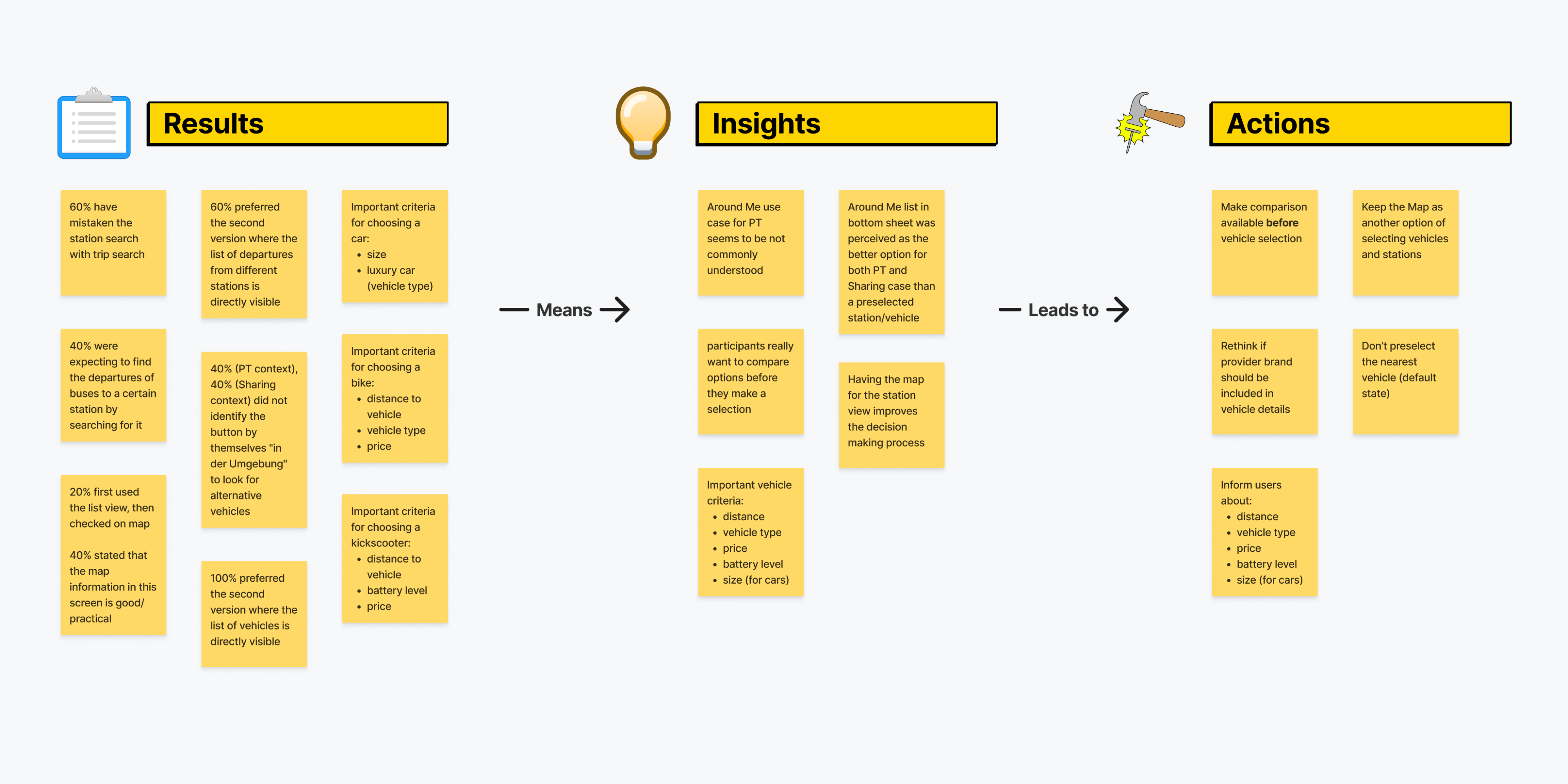
Validating our first designs through moderated user tests revealed the most important information of what needs to be present in the list view. The participants also underlined the importance of being able to see the map as it contains the path to a vehicle or station and is an easy way of validating the selection.
List, Map and Filters
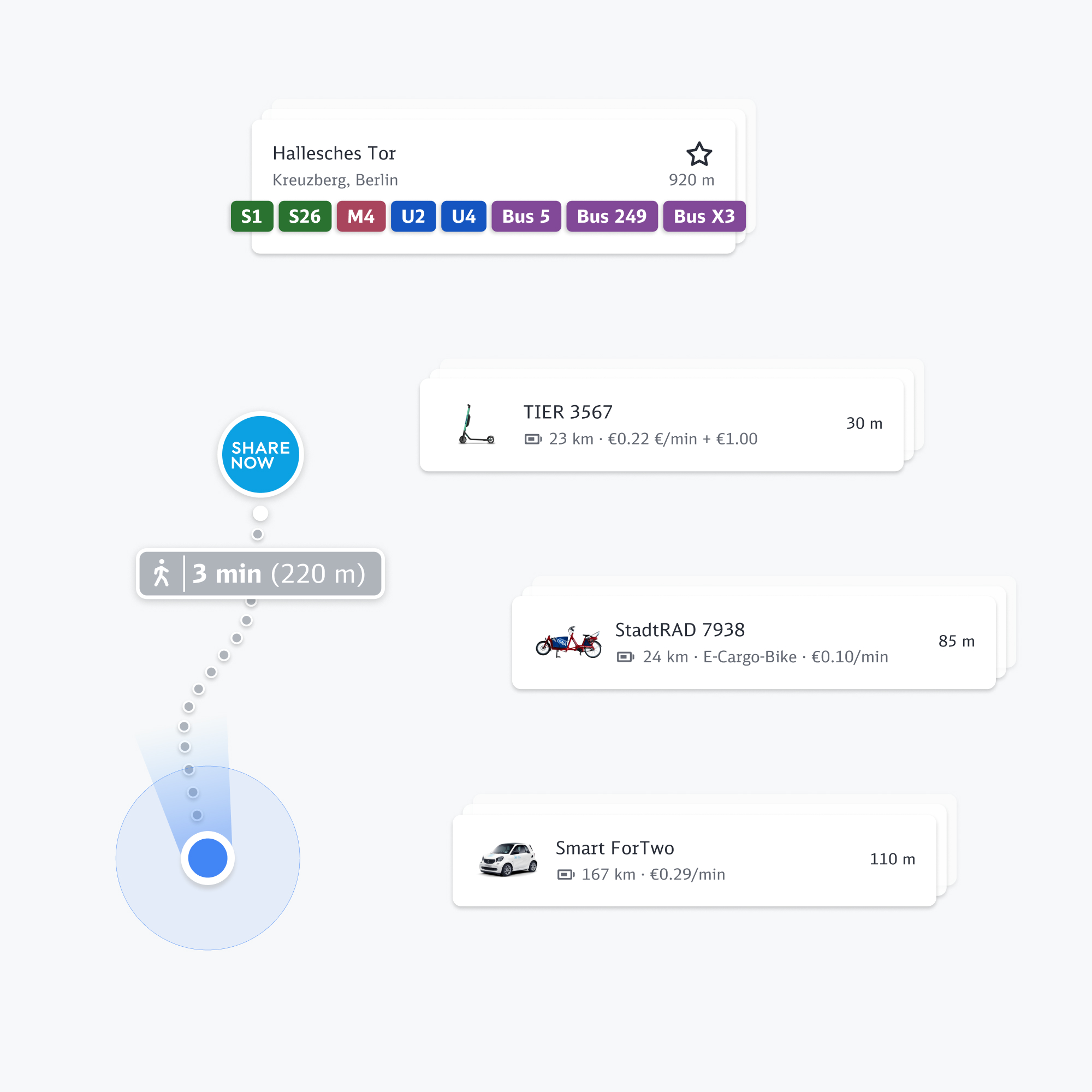
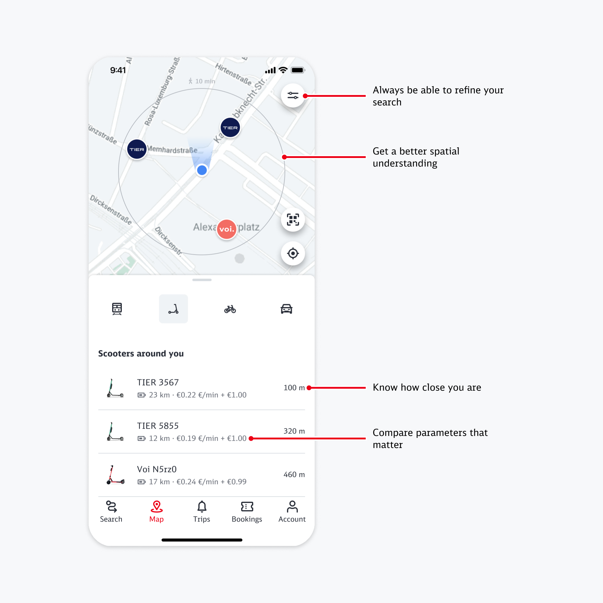
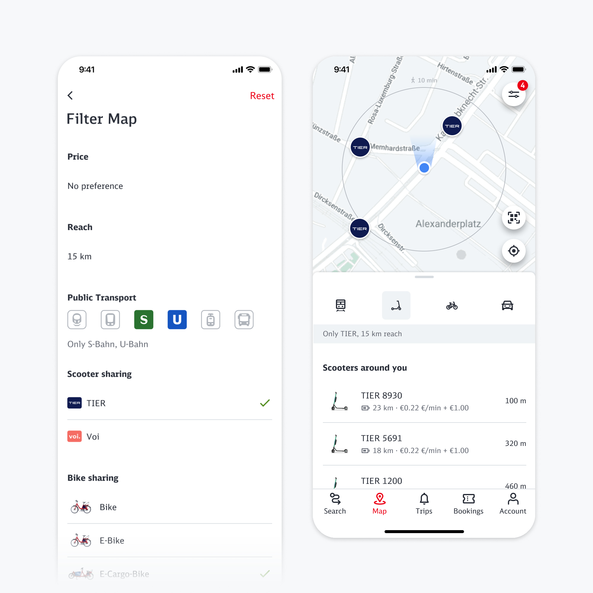
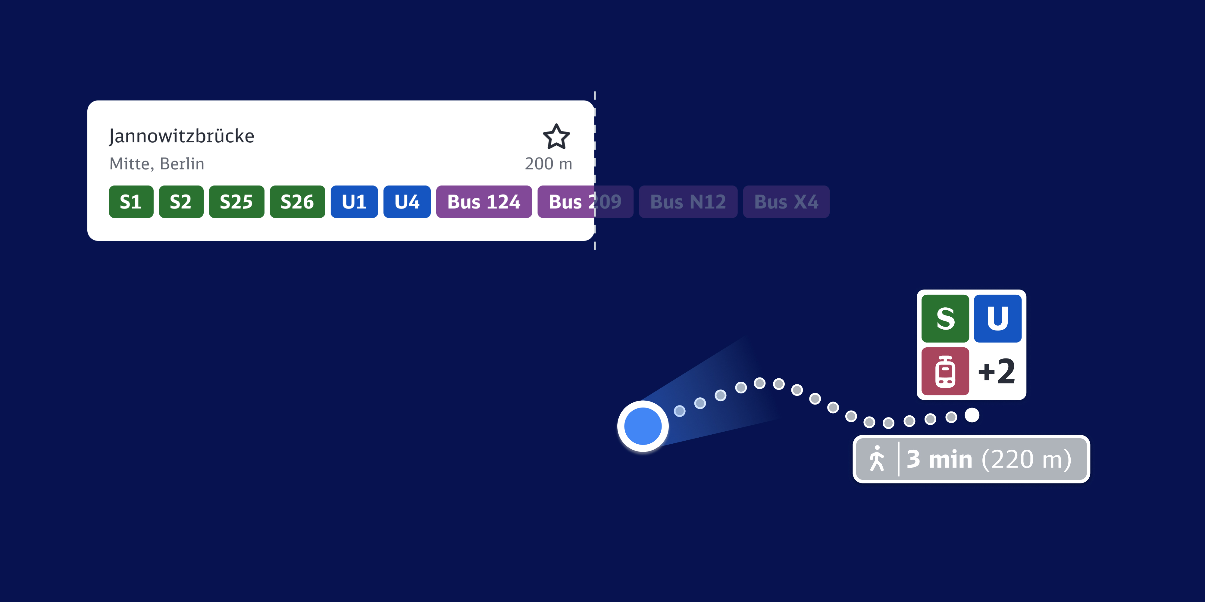
Based on the results we restructured the list items to contain the most important information. For the public transport category the list item contains all lines that depart from that station. Since the number of departing lines often exceeds the width of a list item, the lines overflow the screen and users can swipe through them horizontally. This maximizes the amout of information per list item. We also emphasized the map as a tool to help users understand what they actually can see in the list and added a circle that shows the average distance that can be walked in 10 minutes. Filters have been added to the map to allow cross-category filtering.
Updating Behavior and Reducing Anxiety
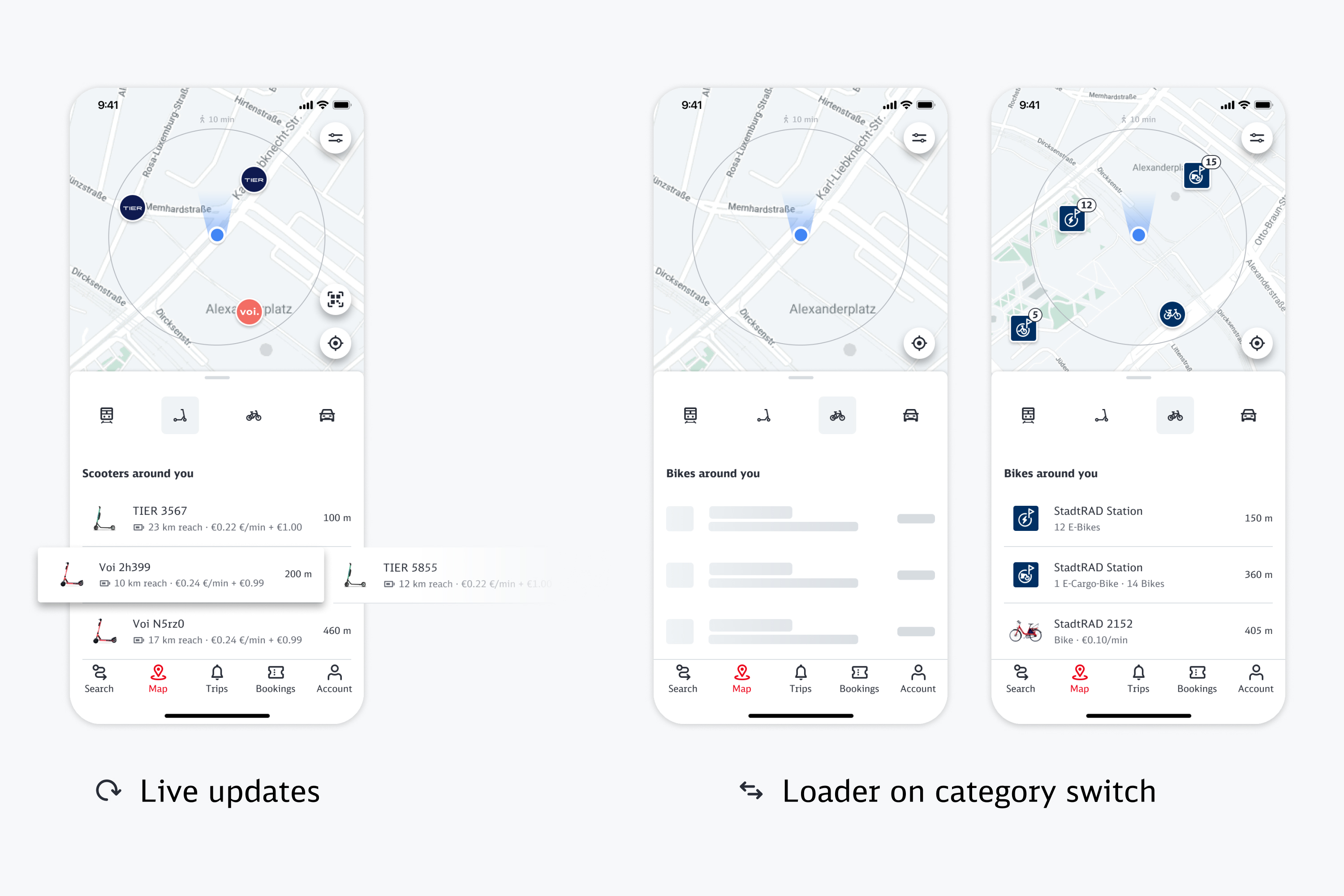
When selecting a vehicle the list needs to be up to date to prevent users from running into a stale selection. Showing a skeleton loader proved as a powerful tool to tell the user that the list is now up to date to reduce anxiety. However, continously showing loading skeletons in an active list view might distract users while browsing vehicles. To solve this, we update the active list in a visually less prominent manner, simply instantly replacing stale items with valid ones. When users change category, we show a skeleton loader to indicate that the new list is up to date.
Selecting Bikes
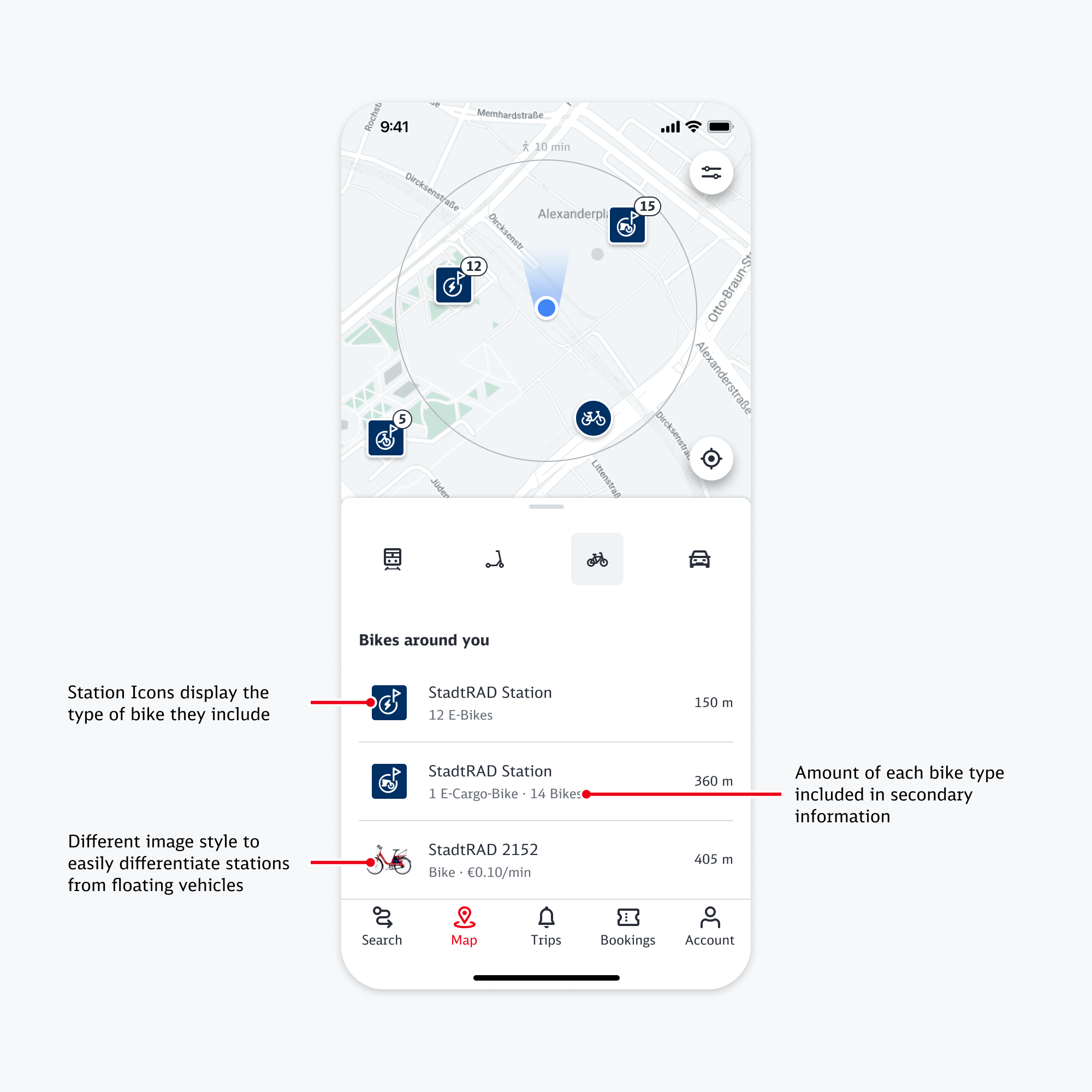
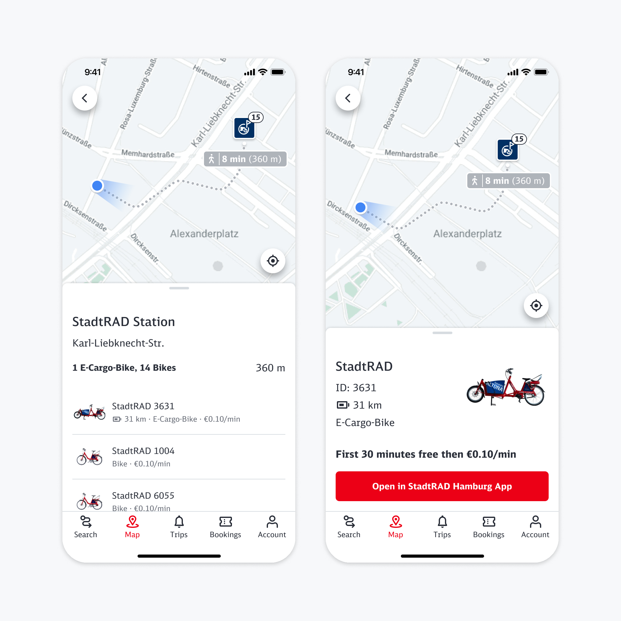
Bike Sharing typically consists of different bike types that are organised in large stations and also free floating vehicles. Being near to a station that includes a lot of similar bikes would quickly fill up the list with similar vehicles that have the same distance to the user, so we needed to come up with a clustering logic for bikes. To find the correct mental model for this I conducted another small round of research, this time internally. One option clustered the bikes by stations, the other one clustered by bike types. Figma added variables and conditions shortly before I created the protoypes, allowing me to create the whole setup for testing on a single day.
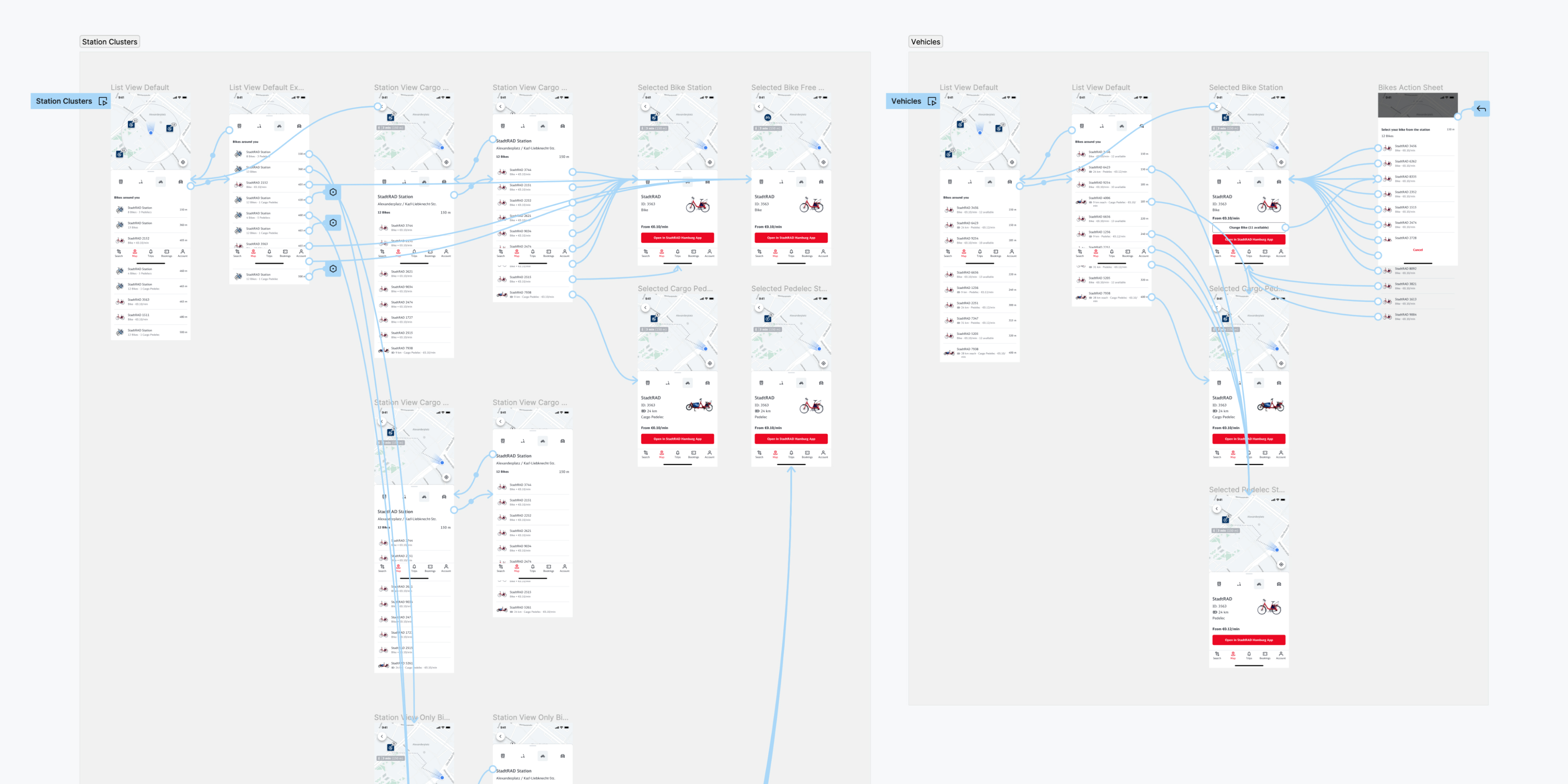
The participants showed a strong preference for the station clustering, as it resembles how bikes are organized on the street. Because the search for a specific type of bike was generally faster in the other version we included the bike types that are available at a station in the station icon which is shown in the list.
Say hello
I love to team up for improving or designing new things from scratch. If you are curious about what we could do together, say hello!
© 2023 Daniel Büker
Legal notice